Visualizing Disaster Data
ReadyMapper is a platform I collaborated on development and UX design. It was built by Stamen Design for the non-profit Direct Relief.
It’s objective is to support healthcare providers and government officials in preparing and dealing with disasters such as wildfires and tornadoes by providing near real-time population movement, vulnerability, and infrastructure data.
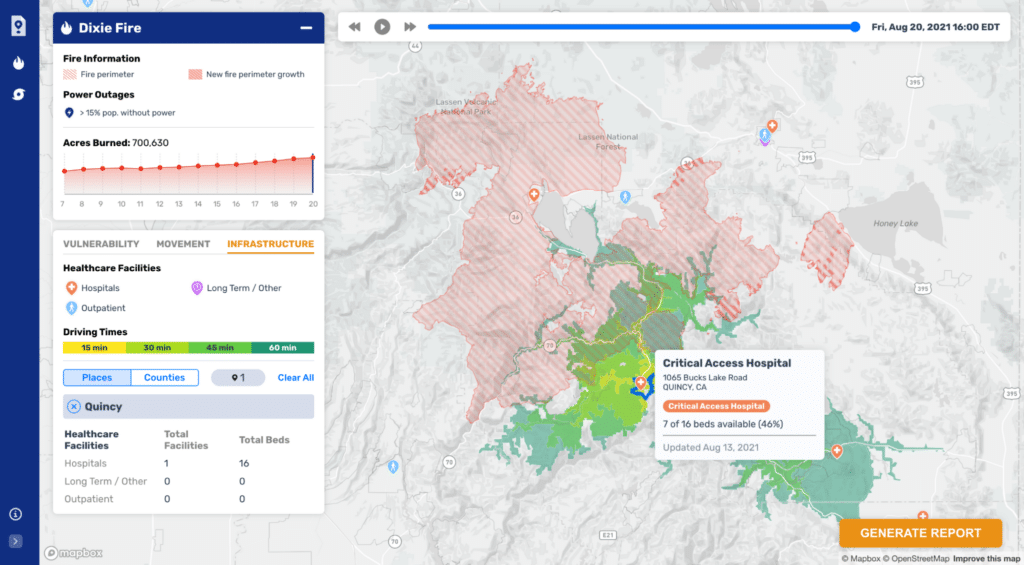 Healthcare infrastructure near the 2021 Dixie Fire in Plumas County, California.
This innovative tool is crafted to serve healthcare providers and government officials in their preparedness and response to disasters like wildfires and tornadoes, leveraging near real-time data on population movement, vulnerability, and infrastructure. Through three distinct tabs—vulnerability, movement, and infrastructure—users gain access to critical insights tailored to address various facets of disaster management and healthcare provisioning.
In the vulnerability tab, users can assess the concentration of populations aged over 65 and their proximity to the unfolding disaster, offering invaluable insights into potential vulnerabilities and areas requiring heightened attention.
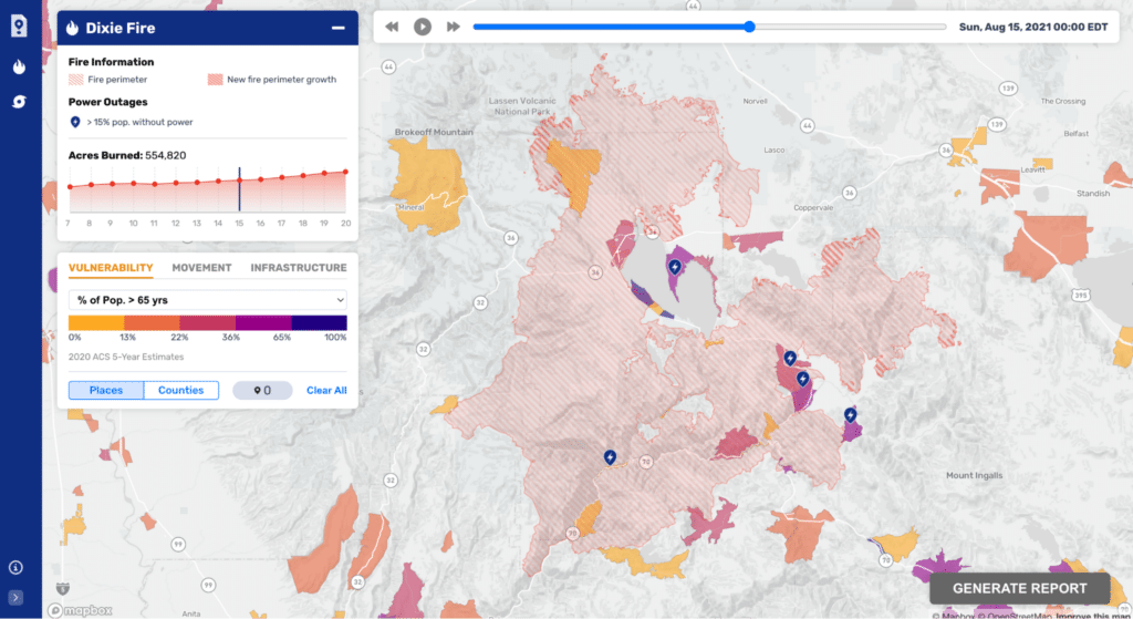 Map of vulnerable populations near the Dixie Fire.
Meanwhile, the movement tab harnesses Meta’s Data For Good to depict population fluxes, illuminating areas of evacuation and influx during crises such as Hurricane Ida, aiding in resource allocation and evacuation planning.
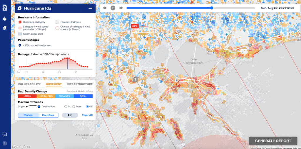 Map of population flows near Hurricane Ida.
Lastly, the infrastructure tab provides a comprehensive view of healthcare facilities, complete with bed availability data, empowering officials to make informed decisions regarding evacuations and resource allocation.
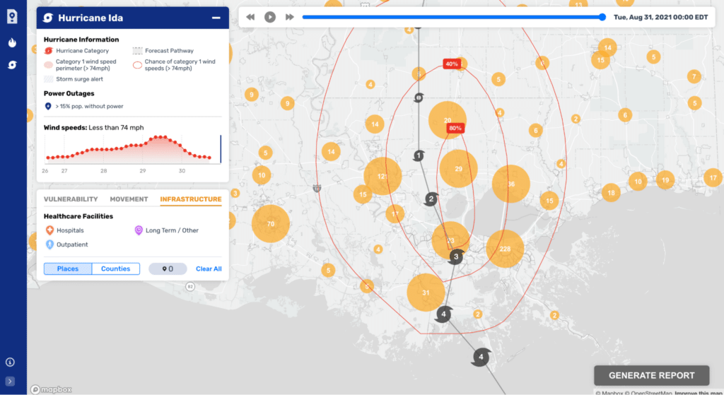
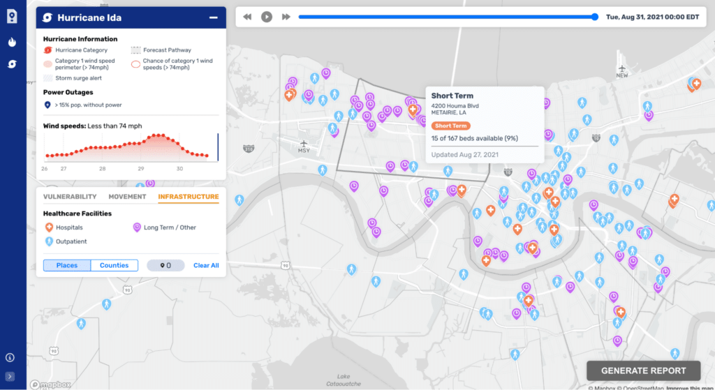 Hurricane Ida predicted track and its proximity to healthcare infrastructure in New Orleans.
You can read more about the project in and article at The Journal for Climate Change and Health or at the Stamen Blog.